The home owners' brief to home-grown interior design company The Scientist called for a sleek and elegant design with lots of storage and which makes good use of space.
As the husband is an avid cook, a more spacious kitchen was also key. This warranted a redesign and reconfiguration of the existing dry kitchen, including an island, as well as incorporating the utility room into part of the new kitchen.
A study area adjacent to the master bedroom was also converted into a walk-in wardrobe in the bedroom.
During the renovation of the three-bedroom condominium in Flora Drive, which took three months and cost about $350,000 excluding furnishings, the existing interior was entirely gutted and redone - from the floor and ceiling to the cabinets and lights.
Addressing the clients' preference for monochromatic colours, the designers proposed a dark palette.
The home owners - the husband works in banking and the wife is a housewife - were concerned that the interior may appear too dark.
However, the result turned out otherwise, perhaps partly because of the abundant natural light from the generous window openings. It could also be the colour strategy adopted by the design team.
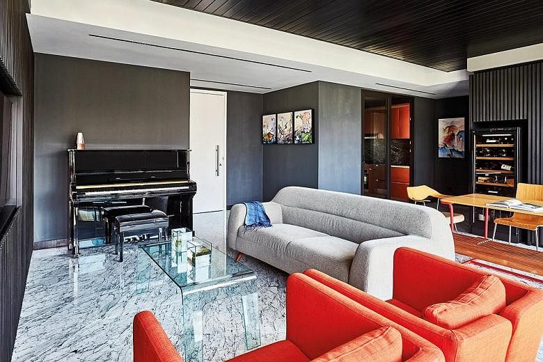
"The floor makes up the largest surface area within the home, so we selected a white Carrara marble with grey veins for it," explain the designers.
This establishes a lighter base against which darker shades of greys and blacks are layered on.
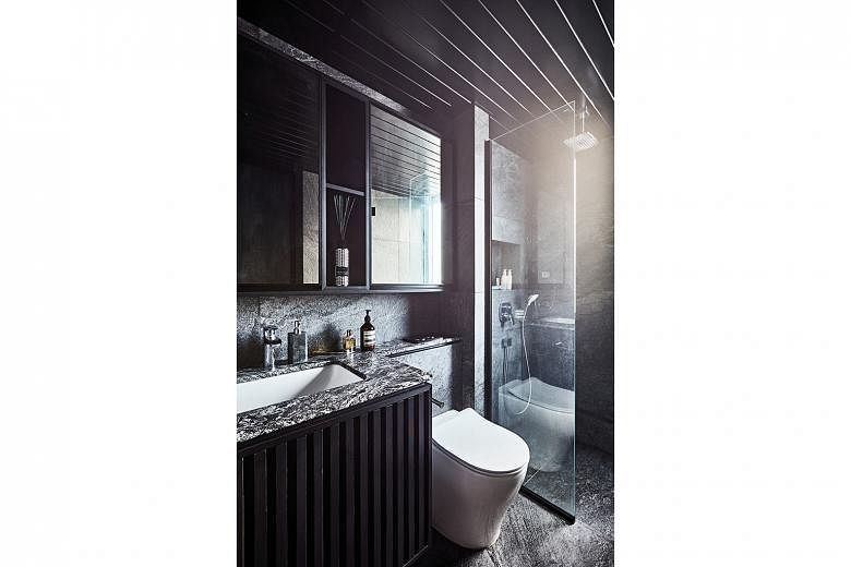
The walls are painted a monotone grey or clad in grey marble or tiles, while the darkest colours are used on the built-in cabinet doors, bedroom doors, door frames and skirting.
The home owners prefer natural elements and materials that are durable and easy to maintain.
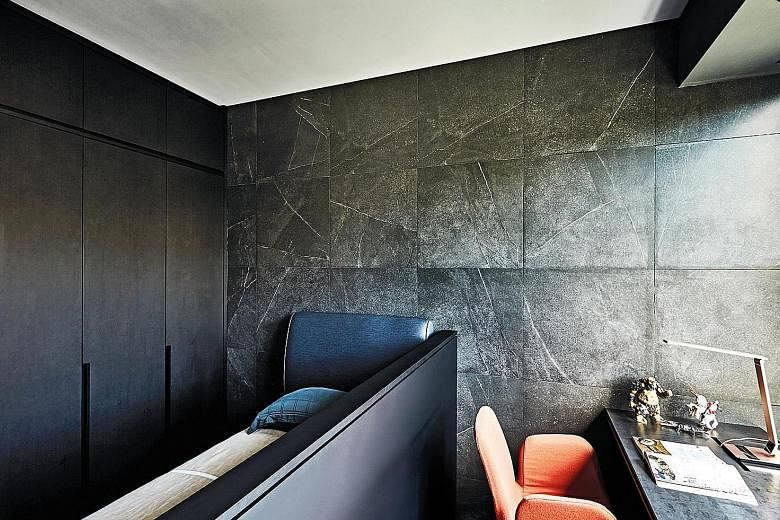
The natural Carrara marble flows across almost the entire floor of the 1,350 sq ft apartment, including the master bedroom and the bedroom of the couple's 13-year-old daughter.
The family, which comprises the 40something home owners and their two teenage children, moved in in December 2018.
However, their 12-year-old son picked for his bedroom grey marble flooring and he chose the same material for the wall facing his bed so he can admire it when he wakes.
In the kitchen, the visually striking rose-gold stainless-steel cabinets are durable and low-maintenance. The materials for other features - such as the hairline stainless-steel countertop and backsplash around the sink - were selected for the same reasons.
As there is no storeroom, storage was an important consideration and the home owners wanted to conceal clutter.
The wall in which the television set is recessed is made up of a series of concealed cabinets designed like a feature wall. The charcoal-grey panels complement the interior colour theme.
Another set of concealed cabinets is located behind the dining room, together with a built-in recess that neatly houses a chiller for the home owners' wine collection.
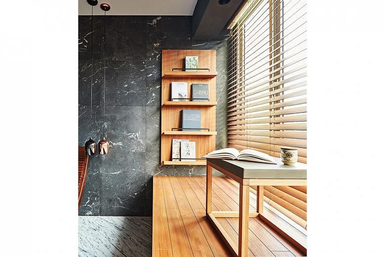
The bedrooms' bay windows have been transformed into more functional elements.
In the children's rooms, study desks were built over the windows. The designers also built a low partition to separate the study and sleeping areas.
As for the master bedroom, the couple wanted a spot where they could relax and read, so the team extended the bay window to form a platform. The accompanying cushions and a wall shelf for books and magazines imbue the space with a Zen-like quality akin to a Japanese tea house.
• This article first appeared in the April 2020 issue of Home & Decor, which is published by SPH Magazines.

• Get the June and latest issue of Home & Decor now at all newsstands or download the digital edition of Home & Decor from the App Store, Magzter or Google Play. Also, see more inspiring homes at www.homeanddecor.com.sg